Have you ever wondered why design is so important for your brand? Is it time for an update? In this article, we’ll tell you firsthand about what we’re doing to update Workana’s visual identity in order to show people who we are and how we want to present ourselves. We hope this article will help you reflect on how you market your brand.
Design is one of the most important pillars of brand communication. Thanks to design, brands can quickly set themselves apart from the competition, convey values, emotions, and trustworthiness, and establish the basis for user experience for our users.
Why is Design Important?
- It helps you create a consistent and recognizable brand identity
- Visuals have more attraction power: it’s easier to understand and empathize
- Clients value high-quality design
- It allows you to provide your users with an experience
- It’s a sign of seriousness and commitment
- It allows you to set yourself apart from the competition
Reasons to Invest in Design
Investing in design is something that a lot of companies consider to only be necessary at the beginning of the process to create a logo and color palette, but the truth is that it’s a process of constant improvement because neither the market environment nor the user needs stay the same over time Therefore, a designer doesn’t just “create a pretty logo;” they work as an essential strategic element, illustrating the brand’s history in the most attractive way: visually.
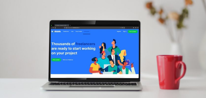
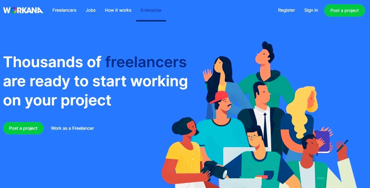
Rebranding: Workana’s Case
We’re proud to announce that at Workana, we’re undergoing a full visual makeover, and we’re interviewing the duo that’s leading this project: Pablo Scillia and Agustín Boaretto. They told us about their experience during this process and shared some insights that we should keep in mind in order to increase our effectiveness and the strength of our visual identity.
Why is a Brand’s Visual Identity Important?
Pablo Scillia: A brand’s visual identity is a fundamental part of their positioning in the market, their communication style, and the experience that they give their users because it’s through their visual identity that they establish specific expectations and evoke strategic emotions that allow them to create a bond with the target audience. The colors, typography, graphic elements, and other variables that allow us to identify a brand must broadcast a message that’s congruent with the company and the user’s needs.
Agustín Boaretto: A brand’s visual identity transcends the question of an isologotype; it’s an entire visual system that amplifies its recognition. A few simple examples of this are two of the most recognized brands in the world: Coca-Cola, and a company that takes its visual communication very seriously, Apple.
One sees the Coca-Cola red and immediately knows what they’re about. It’s the same thing with Apple’s clean and balanced visual aesthetic that can be reflected in every detail including the use of space between text in their packaging.
How Often Should a Brand Work on Their Visual Identity?
Agustín: There’s no set doctrine. A lot of factors can influence it: seeking to improve user experience, “modernizing” a visual identity, wanting to change the brand’s tone (formal, informal, casual, etc.) and even adapting a visual style that effectively contributes to the brand. From my point of view, there are two key points that determine when it’s time to rethink a brand’s visual system:
- User feedback: Learning what people think about our visual communication, what they expect, what the results consistently are and are not, and what they feel comfortable with. If we get ambiguous or not very positive responses, it’s time to rethink how we communicate.
- Advances in visual communication: There’s a saying that “What’s good is brief, two times good.” Visual communication is a process of constant iteration and organic advances that seek to simplify and universalize processes and messages. If our visual system is no longer simple and understandable for the current times, it’s time to rethink it. A clear example of this is airport signs. Since the beginning of commercial aviation, these signs have evolved constantly so their messages are clear and understandable.
Why is Workana Doing This Now?
Pablo: At Workana we’ve created a place designed for freelancers and clients to work together, and both our visual identity and user experience design are based on creating trust, professionality, and newness. After working with the same user interface (UI) for three years on the platform, we realized that it was time to upgrade our design, creativity, and effectiveness standard to keep ourselves competitive in our service market.
Agustín: Workana is a completely dynamic company that had organic growth, and year by year they added new features and tools in order to improve the services they provide to freelancers and clients. In the platform’s organic yet exponential growth, they created a series of different graphic elements over time that began to diverge, compromising the simplification and simplicity that we mentioned before. It’s a natural process that any company undergoing rapid growth will experience, and it can be difficult to holistically see how we’re communicating with the client in every area on a day to day basis.
With this in mind, and by expanding the design team, we began to see the forest through the trees and figure out what was necessary in terms of rebranding. From there, we decided that it was time to simplify and unify our visual system to provide our users with a significantly better experience on the platform.
How Was the Process for Workana?
Agustín: For the design team in particular and for Workana in general, it was a big challenge. In a company that’s so dynamic where functional improvements are constant, it was extremely ambitious for the design team to propose a platform rebranding, (especially since the design team is one of the smallest teams in the company) and we knew we would have to develop it in addition to completing daily tasks, but we were sure that the positive impact that it would have on the platform would be worth the effort.
What’s the Process of Rethinking a Brand’s Visual Identity Like?
Pablo: Redesigning a platform’s UI is complicated because it can take a lot of time and requires all team members to identify the same variables and strive for the same objectives. We started to ask ourselves, “Where do we want to be within three or five years?” “How can we approach users; how do we want them to remember us?”
In order to answer these questions, we needed a lot of meetings, hours of intellectual work, and brainstorming. We knew the direction we wanted to go in, but we were also aware that the stakes were very high because the project was very ambitious.
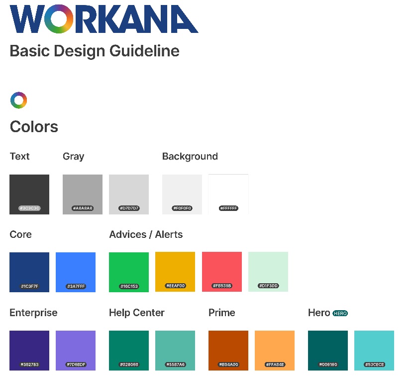
On the design level, we began to work on a new typography and color scheme that helped the readability on mobile devices. We also explored ideas to create a homogeneous artistic direction that would provide the brand with particular identities in its business units that are growing at a rapid rate.
Thanks to our library of centralized interface elements, we generated quick tests to see how the changes we had in mind would impact the current flows so we could visualize the final results and iterate in an agile manner. And not just at a design level; thanks to our development architecture, we were able to start visualizing the final code and determine whether or not accomplishing this project would be feasible.
Agustín: We can outline the process in the following manner:
- Identify and Replace: The first step was to find existing errors, different systems that could coexist in visual communication, the good and the bad, and what would be good to discuss, modify, or eliminate. This survey process can be frustrating at times because it requires us to look at a visual system with a critical eye, and it’s when we start to find little inconsistencies. Like all designers who are a bit compulsive about unification (surely more than one person will relate to this) we want to resolve it ASAP, but all in due time.
- Establishing Scope: It’s very important to understand what we’re looking to improve in a rebranding process. Understanding the scope of these improvements and having a clear objective is very important for the next steps.
- Gather Information: As I mentioned before, knowing what users think is really important for a rebranding process. We can gather information from our users by conducting surveys that tell us what they expect from our brand and learn about advances in visual communication systems.
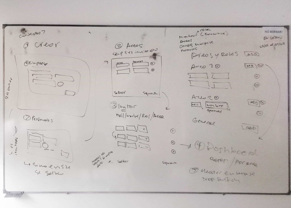
- Search for the Visual System: Drafts, drafts, and more drafts. Having figured out what we needed and having collected information from our users, it’s time to brainstorm possible solutions with different methods that can help us and conduct low level tests through wireframes and mockups to quickly give us an idea of whether or not our visual system will work.
- Armed With a Visual System: After establishing the direction that we’re taking, we have to arm our visual system with all the basic and common elements first in order to apply the system to all of our design and communications later.
- Application: In this stage, we’ve already updated all the high-quality designs with the new developed visual system.
- Quality Testing: If quality control is conducted throughout the whole process, once our visual system update is finalized, we check with the design team and other departments to make sure that everything works how we hope it will work and correct possible inconsistencies that may come up (at this point they should be minimal.)
- Benefits: It’s important to tell our users what changes we’ve made and why in order to make them part of a new and improved story that we’re looking to tell in search of a better final experience.
What is the Most Important Part of the Process?
Agustín: Consistency, simplification, and clarity. I think those are the fundamental factors that we constantly need to review. The visual communication solution should always abide by these design pillars. While they’re not a guarantee of success, these pillars can tell us that we’re on the right track.
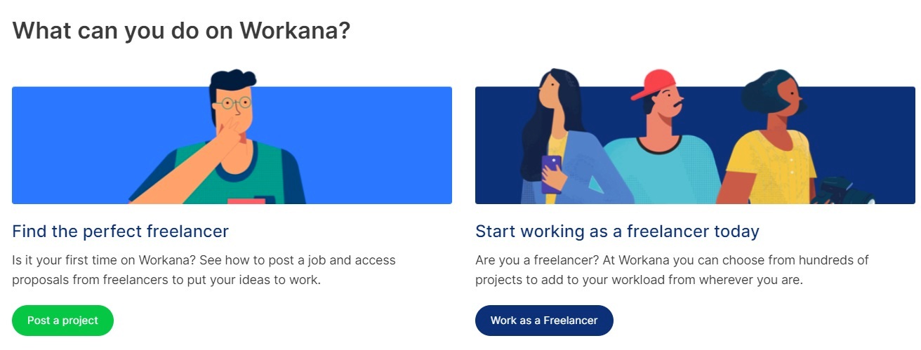
 * See all process here
How do you involve the work team in the rebranding process?
Pablo: In order to accomplish this project, we had to include practically everyone in the company so everyone could understand the direction we wanted to take, starting with the CEOs, Product Owners, and Project Managers. Including the Content team was a fundamental step we took in order to create blueprints of how we wanted to approach the user during rebranding and how we wanted to reach them through our new style and communication tone.
We also included the Development team in the project from the start so they would understand the magnitude of the process being taken on, how it would impact our development landscape, and the potential time it could take to accomplish the process.
Finally, we brought in all the members from the rest of the teams to get feedback on how this would impact their areas from their perspective. Keeping everyone aiming toward one specific object is fundamental when it’s time to undertake a project of this size that will impact the whole brand, especially with teams like Growth and Marketing that constantly work with the identity in order for everyone to start articulating these new ideas in their work.
What kind of specialists should someone include in order for it to be a successful process?
Agustín: There isn’t just one right answer to this question. One designer alone can move mountains on a rebranding project, although personally I think having a creative duo is always necessary in order to have an extra set of eyes to look over initial ideas and have another point of view. So two would be the minimum number of people required for a design team that is planning a project of this type.
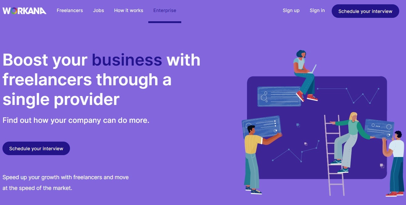
Workana’s design team was made up of four members who were all trained in graphic design and visual communication. We covered the following areas: Visual Design, Web Interface Design, Web Layout, and Illustration.
In terms of maximums, I think it depends more on the reach of the company looking to improve their visual system than on any other factor. For example, companies like Despegar.com involve more than 80 professionals in a rebranding process.
In terms of the professionals involved, visual designers, UI/UX designers, writers, UX writers, advertising executives, communications specialists, illustrators, graphic designers specialized in branding, and more professionals can take part in the process.
Does it take a lot of time?
Agustín: The entire rebranding process can take a considerable amount of time and depends on different factors such as how ambitious the improvement project is, how many ramifications or areas the visual system must cover (there are companies that have a vast number of ramifications which involves a much longer process to cover all the areas.)
In our on-time case, it took us approximately eight months from the time we started planning to the time that it became a reality. It was an arduous and extensive process for a small design team, but we all agreed that it was more than worth it.
What was the biggest challenge? What should people be prepared for?
Pablo: The biggest difficulty we had was finding the right tone for the message that we wanted to send and the parameters that we had to operate within. Once we were able to understand the principles of the objectives as a team, implementing the changes became relatively easy thanks to collaboration with the design and front-end teams, although it took many hours to do.
We learned during development that it’s important to understand that a lot of unforeseen obstacles or little details that can affect more than one may think can come up. So having the right team aligned with the objectives and understanding the project’s framework is imperative when it’s time to make decisions quickly and implement them effectively.
It’s also important to understand that a brand should constantly be changing instead of waiting until it’s absolutely necessary to completely update their image. This demonstrates the brand’s strength to users when it’s time to adapt and understand the market’s needs.
Agustín: The biggest challenge that we’re facing is to achieve simplification, visual neatness, and consistency in designing interfaces without compromising the platform’s features because we didn’t have to lay out functional changes or changes in user history flow. Sometimes it was by a stroke of luck of “inverse architecture” where we had to adapt ourselves to the limitations of the pre existing functionality.
As I mentioned before, the Rebranding process is difficult and extensive (especially when the same team is also working on daily design tasks for the platform), and it takes a lot of trial and error to achieve the best result possible. As a result, it’s important to prepare to draw out ideas, test them, fail, go back to the drawing board, fail again, and fail better.
As Dieter Rams explained in his 10 Principles for Good Design (which we highly recommend reading if you’re a fan of this subject!), “Good design is as little design as possible”, and the only way to achieve this level of “less is more” is to constantly test our rebranding to make sure that it appeals our colleagues and users.
–
We’re glad to have this team leading this project, and we’re very proud of the result. At Workana, we like to maintain a state of constant improvement for all of our processes, and our visual communication is no exception.
We’d like to invite you to take some time to think about your company’s visual communication and ask: am I broadcasting the values that identify me the most? If not, we’re here to help.
—
You might also be interested in:
- The Power of Remote Work in the New Low Touch Economy
- The 8 design principles you should know before hiring a freelance graphic designer
- 15 amazing logos created by Workana freelance designers
- Think video: everything you need to know about video marketing
- Get the best Branding for your e-commerce with a dream team of freelancers
- 5 marketing needs you didn’t know you could solve with freelancers
- I Joined Workana; Now What?