Did you know that many times colours may be the only reason for someone to buy your product?
All colours are known to have a powerful psychological impact on people’s behaviours and decisions. This knowledge has been thoroughly taken advantage of in Marketing, through research studies linked to colour psychology, carried out by designers and web content professionals.
Currently, it is recognised that each colour causes stimulus and gives rise to different reactions on each individual. Also, studies conducted by Loyola University have shown that colour can increase brand recognition in up to 80%.
And don’t think this is the end of that! When it comes to content production, colour can help you to stand out. You must make that your audience see, feel and want what you expect them to. The colours you choose will also affect your web’s usability and marketing strategy. Precisely because of this, an insight of colour psychology proves vital for making your content successful.
Having said all that: are you ready to get to know the meaning of colours?
What is Colour Psychology?
In 1810, German poet Johann Wolfgang von Goethe published a book named “Theory Of Colours“. This may have been one of the earliest contributions to this field. Even though it lacks for a scientific base, in this book Goethe states that black, from a human psychology standpoint, is a colour in itself, and not the absence of colour, as scientists affirm.
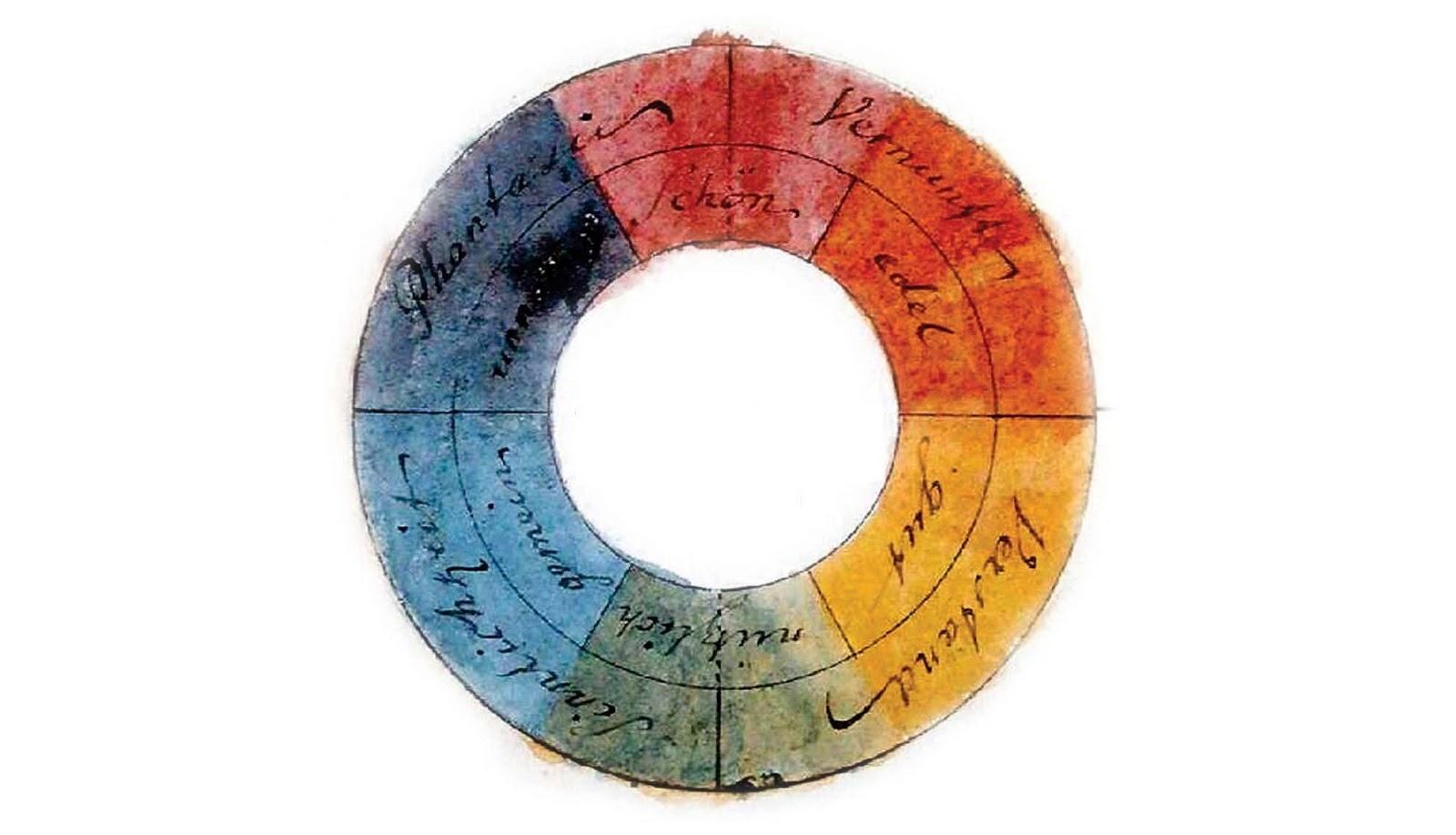
Approximately two hundred years later, the inputs provided by psychologist, sociologist and professor of Communication Theory Eva Heller, thanks to publicity and propaganda, became one of the key contributions to Colour Psychology. Her research is considered the fundamentals for people who work with colours on a professional basis, regardless of their action area.
To conduct such studies, Eva Heller interviewed some 2,000 people of varied professional backgrounds with ages among 18 and 97 years old, to find out the following:
- Their favourite colours
- Those colours which they liked less
- The associations made between colours and words.
The outcomes of her survey were published in a volume that turned out to be a reference on the subject. We are talking about the book “Psychology of Color: how colorsact on feelings and logic”.
The importance of colours in Marketing
Colours have a significant impact on our minds and in the way we relate to products and experiences. Therefore, insight into colour psychology is of crucial importance when we are to design a successful Marketing campaign, especially when dealing with Content Marketing and leads generation. Besides, these notions can be professional freelancers’ great allies, helping them to obtain better results in their work
An adequate colour palette can turn into a powerful tool, collaborating with Relationship Marketing, attracting new clients through the creation of content and user experience. Moreover, inadequate use of colour psychology could even reduce the effectiveness of your main Marketing strategies.
Additionally, colours have an impact on the emotions of your prospects and actual clients, since they lead them to reactions and to the taking of concrete action. Therefore, they can become a massive-range tool on experts’ hands.
Jill Morton, a brand specialist and founder of Colorcom consulting discovered through his studies that people make a subconscious assessment on a particular product and that from the very first view, up to the first 90 seconds, 90% of their evaluation is based exclusively on colour.
Colour can improve readability by 40% and learning between a 55 and a 78%, while comprehension can prove even 73% better. Colours are part of a brand image, and thus the proper colour option will help you convey the right emotions, which, ultimately will collaborate for a user to opt for your services.
But after all, what is the use of each colour?
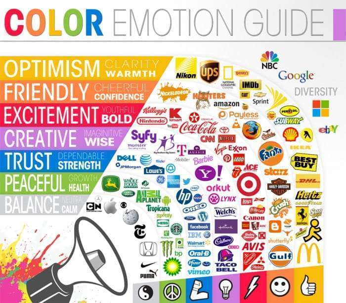
With a vast range of colours, studies which research their meanings have already revealed that each colour develops a function. But far from the strict psychological aspect, thinking as a marketing professional, I would say that colour plays a role in ensuring a particular brand’s visibility and differentiation against its competitors, apart from improving communication and highlighting your product or service,
As I have already mentioned, colour is the first impact a user receives, so take advantage of this non-verbal communication!
Just an idle curiosity: 95% of the brands employ only one or two colours, and as little as 5% uses more than two colours in the logotype. At the same time, 41% of the brands only utilise text, with no additional visual effects.
It is also essential to recall that if you are developing a product that will be sold abroad, it is worth studying the cultural features in other places in the world. As a matter of fact, the same colour can have different meanings which will vary according to the culture and venue of reference.
Firstly, to choose the right colour for your business, you will have to make the following decisions:
- Segment: what is the branch-activity you will be working on?
- Target audience: to who are your products or services devoted? What kind of people are you expecting to attract as clients? (age group, social status, etc.)
- Understand colour psychology: colours not only express our feelings, but they can even rule us. As an example, warm colours cause more vigorous and expressive emotions, while cool tones convey a sense of comfort.
- Correspondence between colour and product kind: to take an example, if your product is food, it is not advisable to pick colours known as “not eatable” like blue. However, in detergent TV commercials this colour will be very efficient.
- Current colour trends: Every year, Pantone launches colour palettes that mark trends on a particular time of the year and are directly reflected in the fashion industry. Therefore, a fact to consider is not only that the colour range fits actual trends. Don’t go blindly following fashion –it is better to let common sense and intuition be your guides.
- Versatility: Choose a specific colour and imagine it will be present on your product packaging, customised boxes or a magazine cover, and even on websites and television; You will see that not all colours look equally good in different places.
So what is the meaning of each colour?
In the first place, I would like to remind you that colours may have different meanings for diverse demographic and age groups, culture and nationalities, even though there are some almost universal common similarities.
The best method to determine the proper colour (or colours) for your brand or website is to consider the target group you intend to reach and the emotions you aim to bring out, as I have mentioned in the previous point.
Individual colours and how you can use them to your business’ advantage
Red
Basically, red provokes sensory stimulation. Red expresses emotions such as passion, strength and many times, even fury, anger.
Use this colour for the following communications: ad, danger, strength, determination, courage. Red conveys power and credibility and is frequently utilised in segments as food, vehicles, technology and agriculture and more rarely in the energy and financial sectors or in airlines and garment industries.
Blue
Blue instils reliability, trust, certainty and safety; it is associated with the seas and oceans’ tranquillity. Light shades of blue convey friendliness, while dark ones communicate experience, success and stability. It is a colour that proves reliable, respectful, safe and responsible, actively used in sectors such as energy, finance, airlines, health and agriculture.
Green
Green is strongly linked to the plant world and life. It transmits serenity, rejuvenation, prosperity, health, and optimism. In general, it is used in sectors like energy, finances, food, household effects, and technology, while it is almost inexistent in garment and vehicle sectors.
Purple
Purple is connected to nobility, wealth and luxury. Dark purple conveys elegance and mystery. It is often used in financial, technological and health segments, but rarely appears in energy and agriculture ones.
Yellow
Yellow is one of the prettiest colours, partnered with the sun. It communicates happiness, hope and optimism. Bright shades of yellow are often used to attract attention and gain visibility, while the darker ones suggest wisdom, intelligence and curiosity.
Yellow is actively used in the energy sector, food and household products, but you will rarely find it in finance, vehicle or technology enterprises.
Orange
This colour conveys light, joyfulness and warmth. It is a mixture of yellow joined with the energy and courage of red. It is lively, vigorous, friendly and kind, ideally expressing movement and art. It is usually employed in technology and health, but very seldom in enterprises connected to the sectors of energy, finances, airlines, vehicles and garment.
Brown
It may not be the most exciting colour in visual terms, but it is directly related to conservatism, experience, reliability and endurance. My suggestion is to use it cautiously since some consumers way connect it to impurity and uncleanliness. It is also a severe colour that can be recourse to when black should not be too intense. Companies doing business in the garment, vehicle and agriculture sectors employ it most frequently. Its use is not recommended in finances, airlines and technology.
Black and grayscale
Black is used by enterprises willing to transmit traditional values and style. It is perfect for luxury goods and services since it requires power, modernity and sophistication. Black is a colour which portrays refinement, seriousness, gravity, control and independence, yet it can also be employed to show evilness, mystery, depression an even death.
Unfortunately, since it is a very powerful colour, the excess of black may cause sadness and general negativity. Therefore, you should use it with moderation and mainly in text rather than visually, strictly speaking. Black is intensively used in garment, technology, and vehicle segments.
White
White transmits purity, cleanliness, simplicity and innocence. White can also portray new beginnings, and this makes it a standard option for brands related to health improvement and products for children. White is actively used by enterprises running a business in garment and health segments. It is noble, pure and soft.
Conclusion
On this article, we have checked that colours and marketing are intrinsically intertwined. When you use colour in Marketing, you understand its importance and power and recognise its crucial role in the creation of associations on a subconscious level. In other words, you start having a comprehension about colour psychology together with all the possibilities and benefits it can provide to your enterprise.
Colour has a direct impact on human psychology, and it is a fantastic field of study, both from theoretical and psychological standpoints. It can draw potential buyer attention as much as it can scare him through the creation of unpleasant associations.
From Newton to Heller and including Goethe, colours have been fixed objects of study in the most diverse areas of knowledge, due to their impact on human behaviour and thinking.
When it comes to picking colours, counting on the help of a professional with expertise in this field can make a significant difference. If you select one or two shades and you feel clouded by uncertainty and doubting on how your audience will respond to them, you may delay your business success.
Here, at Workana, you have access to thousands of professionals proficient in the fields of Design, Content Marketing, to mention but a couple of important categories available. These experts will be able to employ the right colours in your content and its layout, avoiding colour-testing in the darkness to determine colour and channel combinations suitable to gain more clients and increase your leads and website traffic.
Also, we know these associations indeed help to motivate emotional responses that can end up in sales, brand loyalty, conversions and extended life-span.
Then, which way will you take from now onwards?
Follow Workana at the leading social media. You will have daily access to relevant content and information to help you scale your business!