
These days, online sales is the latest trend. That’s why it’s really important to make your way into this field and get the chance to experience ecommerce, or even migrate your company to this world, as it’s evidencing great benefits.
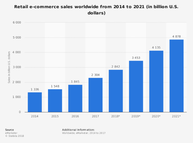
As shown on a report published by Statista about the sales growth of ecommerce enterprises between 2014 and 2021, sales around the world for this sort of negotiations were 2.3 trillion dollars in 2017, and might reach 4.88 trillions in 2021.
On the other hand, information gathered by Forbes magazine from market surveys held in 2017 reveals that 51% of American population would rather do their shopping through the internet, which translates into around 23% annual growth for the online trend.
It is essential to consider the statistical indicators from the American community, taking into account that the US is the world’s top economy, according to research quoted by Diario Gestión and performed by the International Monetary Fund (IMF).
The economic evidence points at the undisputed success of this market trend. However, even when profit may be huge, commitment and investment should be levelled when you’re dealing with e-commerce. Here you need to invest in order to win!
Usability: The importance of making it easy for the client
You might think that quality, customer care and a differentiated service are everything to your business. There are, however, a few other things you should invest in to achieve a successful ecommerce site. For instance, using all of your online resources.
In this world of online business, you must be familiar with the term usability, which has to do with the analysis of a website user’s experience, how friendly a site is for him.
Although this affects just any portal, no matter its nature, when we are dealing with business the user’s experience is absolutely decisive.
The fact that your clients or potential clients can easily access and navigate your website might make the difference between increasing your sales or dropping your website visits. In a competitive world such as the internet, standing out and achieving online positioning demand the best of resources.
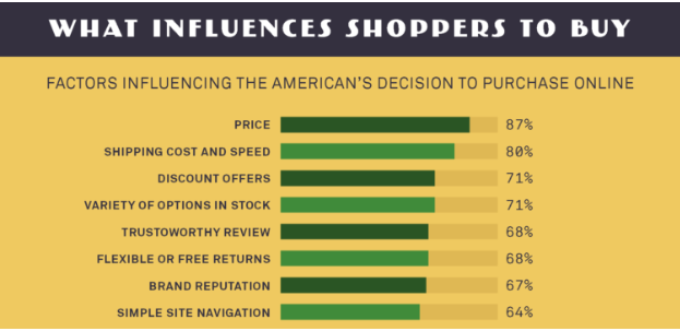
Actually, among the factors that impact directly on the decision of many Americans to do their shopping on the internet, as shown by portal Small Business Trends, is that a simple site navigation accounts for 64% to them. That means that 64% of successful sales will depend on dedicating the necessary time to your website.
That’s why it’s a huge mistake to put usability aside, for unfriendliness might undermine the success of your ecommerce site. Usually, these drawbacks are the result of ignorance or lack of support by a true expert, which means that despite their relevance, they can be solved quite easily.
Let’s now focus on the 8 most common usability mistakes:
1. You can’t navigate the site on different devices
Just imagine how easy it would be for your clients to access your sales and services from wherever, as they perform other activities.
To achieve that, your site should be easily displayed on any mobile device, which means that it should count on a responsive design, allowing size and distribution adjustments.
Besides, having an available app should not be mistaken with the choice of users. Most of the clients are unwilling to download extra apps to access information about your products and simply choose to navigate your site from their phones.
2. Information layout is impossible
In this case, we are referring to the organization of information being a nightmare for the client at first sight. There are many ways to mess it up here.
For instance, font type should be taken into account on the final site. Font color should be thought of in contrast to the background and the general layout, as the distribution of the information boxes will be essential..
Nobody is willing to read a bunch of small, grey letters on white background and without pictures.
3. A confusing distribution
Your clients will feel much more at ease navigating a simple-structured website, well defined, with their menus and options, or even a navigation map.
Too many hyperlinks, options or buttons are confusing…

4. You don’t give answers to your clients
For one moment, picture yourself as the client. You’ve just made a transaction, or registered on the page, or requested a download, but the site has not shown any message to let you know that this process was successfully completed.
Clients, especially those at an ecommerce site, need to get confirmation that their collections and requests have been received, and that their information is safely kept.
To help you see the importance of this, we can quote Darcy Vergara, a usability expert, who commented on Maestros de la Web that to her, Amazon’s success is a great example of the impact of this point on ecommerce sites. In her opinion, the key element of the portal is the overall experience they offer to their clients, “(…) if you write an email to them with any request, they send you an accurate answer within the next 2 minutes”.
5. You don’t enhance the web search
Think of all the web portals your clients can visit in just one day before they get to yours.
The amount of information they receive is such that they find it exhausting to go through a search, being bombarded with loads of information and products.
For this reason, you can help them find what they need or at least guide them through search bars or search filters, providing clear visibility to top searches.
6. You don’t show an error message
In many cases, your website will generate errors during navigation, due to the amount of traffic or the connection type.
That is why it’s important to develop a customized landing page, that shows a kind message for the client, explaining the error and inviting them to visit other links on your portal.
7. Editing is not possible
If you don’t have an option to edit, you might find big problems later on. For instance, the sales order of your client might not be delivered in time, or it isn’t what the client expected or it’s not the right order, as a result of incorrect filling out of the information.
Cetelem, el Observatorio Ecommerce, assessed the impact of sales returns on the sales process, and the preference of clients to use web portals. In their research, quoted by Gabriel Castro for TLG Commerce, it is said that 41% of people don’t dare to do online shopping, because of the inconveniences that might bring about the sales returns.
From there, the importance of avoiding them by getting correct information, the conclusion of all sales order forms and the possibility of editing the information.
8. Unfriendly catalog design
Being a business person, you may have catalogs or brochures of your products, where you refer about your products using specific terms you’re familiar with. The clients however, are more likely to identify them by the usual names or even by their appearance.
Including pictures and clear labels will keep your clients’ loyalty.
So the best way to enhance your ecommerce site is empathizing with your client, and see your web from the eyes of those who are looking for products or services. To achieve this, you might find it useful to count on expert help that might add value to your website.
Finding the right person is easy, accessing Workana and creating a project that will lead you to the best-qualified freelancers. Come and give it a try by clicking here.