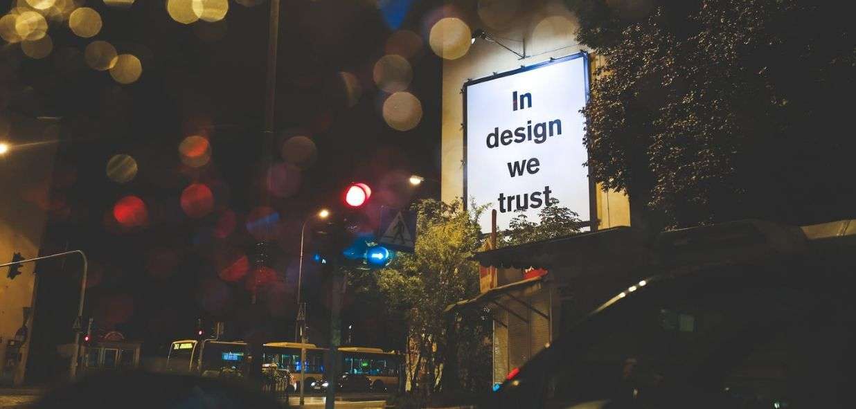
“Good design is good business”. The famous phrase by Thomas J. Watson Jr. (back then president of IBM) summarizes very well the importance of the graphic designer’s job for a business. After all, “a good design” makes “good business”.
Some decades ago, high range executives would see design as an aesthetic or corporate image aspect. But, nowadays, delegating the design specifically to the marketing team is highly recognized as a key element in the business strategy.
According to an article posted on Time in March of 2018, a study shows that many of the main (and most lucrative) organizations in the world have a design director and that they continue strongly investing in that area. And, half of them now declare that “design plays a huge role in how success is achieved”.
And the importance is real: the designer is responsible for the creation of the brand’s visual identity, communicating with marketing as well as with the consumer. The designer is the person in charge of the logo, the business cards, the e-commerce’s appearance and usability, the appearance that your product will have and, for the way that it will make your client fall in love with it.
But, before hiring a freelance designer in Workana, there are 8 basic principles regarding design that you should know better. Having a basic knowledge of the subject is very important before posting your project on the platform. And, you’ll be sure to find the best professional and you’ll be able to have a much more fluent conversation with them.
And, of course, you will be more prepared to provide the necessary feedback during the work. Let’s analyze:
1. Alignment
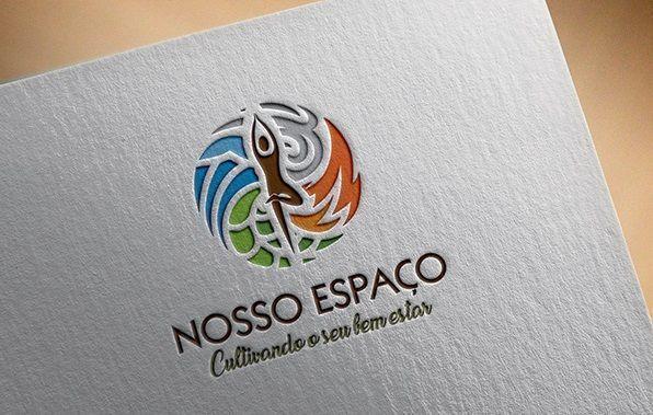
(Julio Henrik, freelancer in Workana)
The alignment is one the most important elements in a design piece, because it’s responsible of creating the feeling of organization and it allows the design to be “clean” and easy to understand, eliminating the mess.
Text orientation in the West is from left to right and from up to down. When there is something out of these patterns, the brain gets confused and the information may not get to your client.
This is why the elements and texts must be aligned to each other and with the background. Of course, there could be exceptions in artistic creations, but they should be very well thought out.
2. Contrast

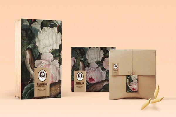
(Ana Chiarelli, freelancer in Workana)
Our vision requires contrast to understand the given message, or else it will simply cause us difficulty to distinguish what is written or drawn. This effect occurs when two elements are put against each other (dark colors over light colors, for example).
It’s contrast which gives the necessary emphasis to the most important elements of the design and it guides the consumer towards what the brand wants them to really see.
3. Visual Hierarchy
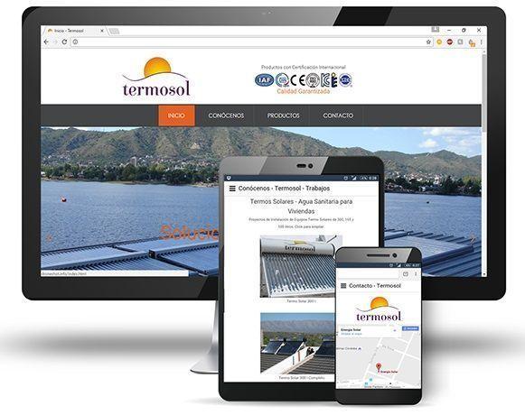
(Sammy, freelancer in Workana)
When a design element has many pieces of information, it’s important to order and prioritize them. This principle is called hierarchy.
This form of highlighting is generally done with different font sizes, a variety of colors, etc.
When you go ahead and post your project, keep in mind the message you’re trying to transmit. If you want to have your business’ name next to a symbol and your slogan in the main image of your website, for example, the designer has to make all this appear in an organized way, orienting the attention towards the brand first.
4. Balance

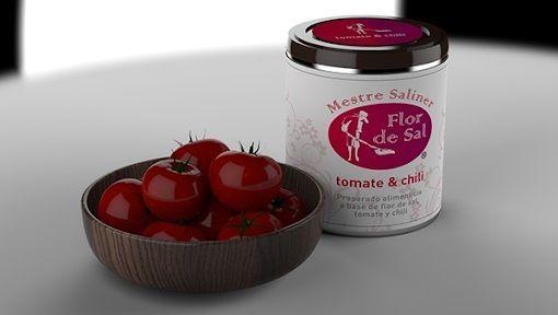
(Suzane Oliveira, freelancer in Workana)
The principle of balance guarantees the structure of the design in general: this allows the work to be balanced in its colors, forms, text boxes, etc., without making it messy or “heavy”, creating barriers for the final goal.
There are two types of balance: the symmetrical one occurs when the elements of the design are equally divided in both parts of the project; and the asymmetrical one uses scale, colors and contrast to achieve this principle.
5. Color
(Luciana Carvalho, freelancer in Workana)
Certainly, one of the most important principles; the color provides the tone of a brand. The color palette must be carefully selected to transmit the idea of the brand, its atmosphere and to make it appealing to the public.
The graphic designer requires a basic knowledge of the theory and psychology of colors in order to build a logo according to what the client wants, because the palette is also crucial for the following principle, creating a pattern.
6. Repetition
(Pablo Lorenzatti, freelancer in Workana)
As we said before, our brain assimilates better when there are patterns. The reason why the principle of repetition is important is: to give strength and consistency to the final product. The color palette, for instance, helps create branding and it makes your business easily recognizable. Also: the menus and the appearance of a website should always be synched.
Basically, the rule is: you shouldn’t randomly play with the job mixing many things that make no sense or that don’t connect with each other. There should always be harmony to create a comfortable pattern for the consumer.
7. Space
(Daniel Malaver, freelancer in Workana)
The blank spaces that are left in are as important as everything else. A certain amount of text, for example, needs to be wisely divided in blocks, so that the reader doesn’t get tired while reading it (or, even to avoid making them desist while trying).
The so called negative spaces or (blank spaces) help create the final art. Many times they even form a new subtle and simple figure in a logo that speaks to the consumer’s subconscious.
8. Proximity

(Miguel Jaime, freelancer in Workana)
Proximity helps create a bond among the elements in the design work, such as text and images. These elements don’t have to be necessarily grouped, but they should be connected, in a close way.
This may occur not only in a special manner, but it can also happen by a connection of colors, font, forms, sizes, etc.
Now that you have a better understanding of the basic design principles, you can post your project in Workana and, you will now know how to identify what’s best for your brand when talking with the freelancer of your choice.