
You may or may not know, but the term usability has gained a powerful relevance in the ecommerce environment.
And the reason for it is because this estimation along with quality and comfort in the use of web pages is highly related to the success of those businesses that depend on the internet.
Usability affects any website because this functionality, simplicity and design value improves its use and the amount of visits it gets. In the case of small and medium businesses and startups which operations base is the web, we’re talking about an importance which translates into sales.
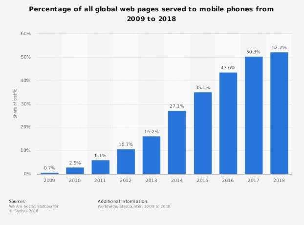
Now, statistically speaking, the Statista portal showed the growth of web traffic through mobile devices, proving that in 2009 the access to these portals was a 0.7%, while in 2018 it’s a 52.2%.
In fact, this same study mentions that these numbers aren’t a surprise at all taking into account the increase in the amount of acquired mobile devices and the comfort they can offer.
And these devices offer access to internet as well as more efficient connections, where a budget and infrastructure don’t allow more complex connection systems.
Now, taking the increase in web traffic from mobile devices as a starting point, we’ll showcase the way it has affected sales. Either for good or for bad, ecommerce is here to stay and, as an entrepreneur who depends on the easy access to an unlimited connection from a mobile device, it’s important to understand that many transactions have a place in this sector.
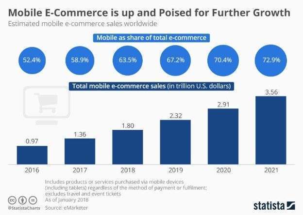
This way, in the following study carried out by Statista in 2018, they evaluated growth in mobile ecommerce transactions worldwide, even projecting the market’s behavior for 2021. Results showed that from a 0.97 trillion dollars in 2016, for 2018 we’re talking about 1.80 trillion.
With these numbers in mind, you can imagine what it means for your business not to be effectively joining the mobile sales world, or for it not to be friendly enough with your potential clients.
Why does mobile usability affect my ecommerce?
So, going back to usability, let’s think about the importance that it has in terms of visits, and therefore in sales. All websites need to get positioned in search engines, and when it comes to ecommerce there is no exception.
Very briefly, we can also talk about two fundamental terms in search engine positioning, such as the bounce rate and the click bate, both negative statistic indicators for Google, which evaluate the visitor’s behavior in the webpage, and how fast they need to return to the search, or how little they’re visiting other areas of our webpage.
With this in mind, Sheldon Xhai from the Supreme portal evaluates the importance of counting on a friendly webpage, with a good usability range or responsive, which is nothing more than a webpage able to adapt itself to the use of devices, showing all the necessary information in the most adequate way.
He says that “if you don’t have a responsive mobile website that users are able to read, they will then “bounce” to another site increasing the bounce rate or they will quickly click back to the search decreasing the click back time (…) With these indicators, Google will determine that your web’s content is irrelevant and therefore it won’t position you among the first ones”.
Now, translating this into an ecommerce; the fact of not being able to be among the first results of the search will hugely affect the possibility of being found by your clients or potential buyers. Now you can see that if we make a comparative analysis, offering your clients a good navigation experience has a lot of impact on you as an entrepreneur.
Now that you’re aware of how crucial a good positioning is and that usability has a lot to do with your ecommerce, you might now think that it’s a very complex subject or even a lost cause.
But, in order to be friendly to your possible clients you don’t necessarily have to go crazy, you just need to get very well assessed and to consider the following advice:

7 elements for your mobile ecommerce to work better
Taking TeamDiligent’s analysis as a reference, we’ll give you some elements you need to have in your mobile ecommerce in order to make your usability grow.
1. The main menu must always be accessible
Remember that a key to usability is that you, as an entrepreneur, put yourself in the shoes of your potential buyer. If the website isn’t cell phone optimized the navigation process will end up being confusing and, the client will eventually click the back button, which we know translates into a negative impact.
If the main menu is always available through a dropdown mechanism, then the user will be able to navigate through the areas they want without having to go back or to abandon the page.
2. The shopping cart should always be there
Just like the menu should always be an available resource, the shopping cart has to be a part of any of the sites that integrate your web because the client should be able to finish their shopping process at any given time, no matter in what part of the portal they might be.
If the user isn’t able to easily find the elements they’ve already chosen to check them or to proceed with the payment, they could end up leaving the page, confused.
3. The best position and image quality
In traditional web, it’s much easier for the client to take some time to read some information and to look for descriptive features. Now, in the mobile universe, the entire shopping process is about how the products look.
On a mobile screen it’s hard to stop to contrast pictures with text; that’s why the images should be the absolute main character with a full capacity to captivate the client.
The fact of having it well positioned in the site while having an excellent quality, will be the key to make your users fall in love with it and to complete the transaction.

4. Technical specifications are important
Even though I mentioned that texts aren’t friendly and that images are the main heroes, the truth is that a product without features makes it an incomplete product.
Although the information you show about the product shouldn’t be too long, it is necessary that you include some of them, like sizes, available amount, and of course, the price. Don’t forget about the product’s name!
5. Friendly titles and background
Let’s touch a very important aspect; our web’s dimensions won’t be the same on a mobile device as they could be on the original web from a computer.
It’s necessary for it to have a range of colors harmonic with the site’s palette; and that the title letters can make an adequate contrast so they can stand out.
6. Be honest with your products
The offered products and services share a particularity; they’re yours. For some reason those clients have arrived to your website in search of what you have to offer, so, you shouldn’t fool yourself neither should you try to fool them with images from the internet.
It’s important for the reference images to be real and for them to show exactly the appearance of what the client’s trying to get, avoiding lies at the moment of completing the shopping process and creating a sense of honesty and fidelity.
7. Forms available always
Forms are the instrument for you, as a business person, to have the opportunity to get your client’s necessary data for sales and to manage your transaction statistics.
If forms are reserved for a certain area that’s not easy to access, then this can cause confusion in the user and an increase in the use of the back button, which we know doesn’t benefit us.
Your mobile ecommerce’s usability is the key to get and to maintain your clients updated with your services, considering that the rate of transactions through mobile devices has outgrown the use of computers.
If you’re in the moment of maximizing your business and you know that usability is a very important step, try working with a freelancer from Workana, trained and available professionals ready to listen to your needs.


